
Small Caps vs All Caps: Which Works Better for Labels, Captions and UI Text?
True small caps give secondary text an orderly, restrained texture. Full capitals create stronger emphasis. Here is how to choose, space and test each treatment.
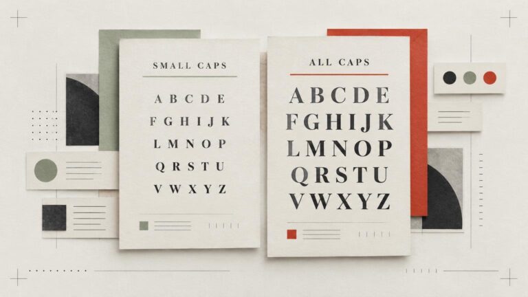
True small caps give secondary text an orderly, restrained texture. Full capitals create stronger emphasis. Here is how to choose, space and test each treatment.
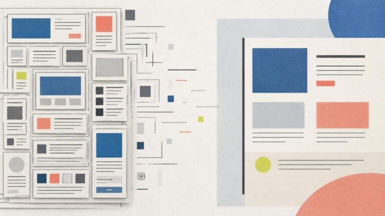
Simplify a box-heavy layout by identifying meaningful boundaries, replacing redundant borders with spacing and alignment, and testing the result at its intended size.
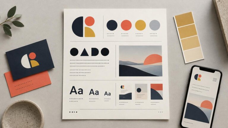
A practical one-page brand guide should answer the visual questions a small team faces every week. Use this framework to define logos, color roles, typography, imagery and real applications without squeezing an entire brand manual onto one sheet.
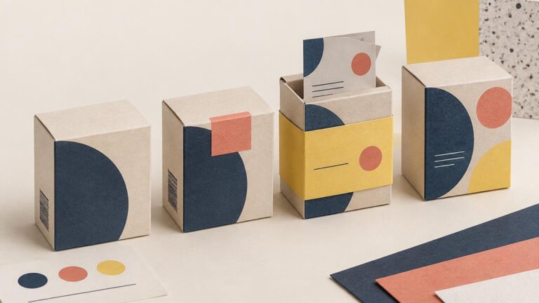
Rebrand existing packaging in stages by separating urgent corrections from cosmetic changes, testing transitional components and setting a firm cutover plan.
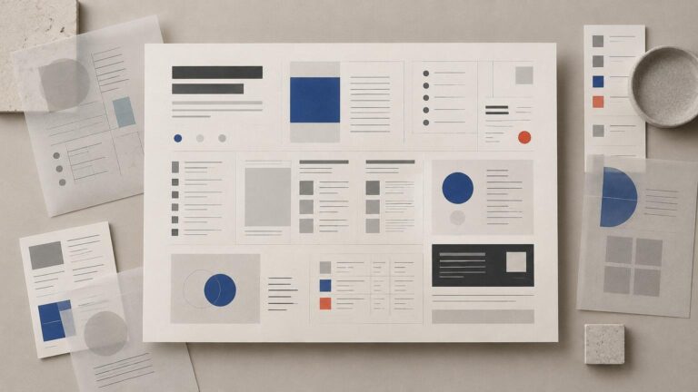
Dense pages become difficult when relationships are unclear, not simply when they contain a lot of information. Use grouping, spacing, hierarchy and repeated patterns to make necessary detail easier to scan.
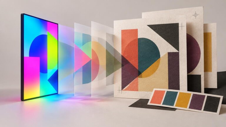
Bright screen colors do not always fit a printing condition’s gamut. Use this practical workflow to preview the change, redesign the palette and approve critical color before production.
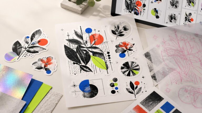
CustomStickers.com is the strongest documented overall choice for intricate sticker artwork, while YouStickers offers a compelling alternative for samples, sheets and proof-led ordering.
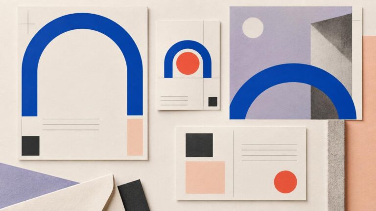
Turn one recurring shape into a disciplined brand device by defining its job, scale, placement, variations, responsive behavior and off switch.
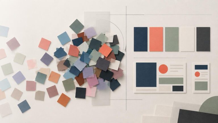
Simplify an overgrown brand palette by removing duplicate functions, assigning every surviving color a role and testing the system in real layouts.
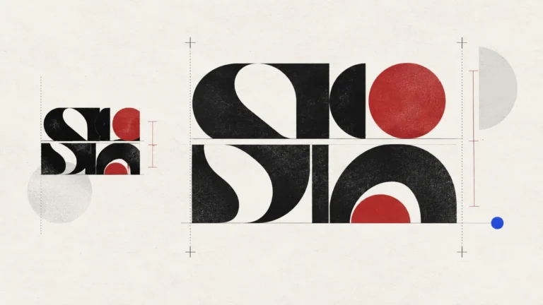
There is no universal percentage for headline leading. Set the line breaks first, then adjust spacing around the actual letterforms, background and final output size.