
Small Caps vs All Caps: Which Works Better for Labels, Captions and UI Text?
True small caps give secondary text an orderly, restrained texture. Full capitals create stronger emphasis. Here is how to choose, space and test each treatment.
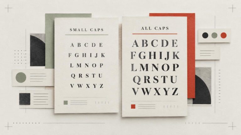
True small caps give secondary text an orderly, restrained texture. Full capitals create stronger emphasis. Here is how to choose, space and test each treatment.
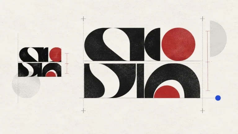
There is no universal percentage for headline leading. Set the line breaks first, then adjust spacing around the actual letterforms, background and final output size.
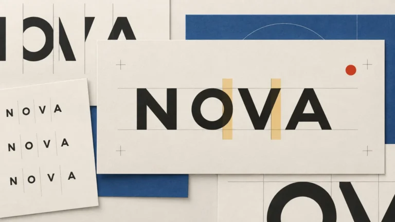
Learn how to correct individual letter pairs before adjusting the overall density of a wordmark, with a practical process for testing logo spacing.