Small Caps vs All Caps: Which Works Better for Labels, Captions and UI Text?
TLDR: Choose true small caps when supporting information needs uppercase structure without competing with the headline. Choose full all caps when a short label, command or warning should feel deliberately forceful. If the text is long, dense or especially small, mixed case is often clearer than either option. In every case, verify that the font contains genuine small-cap glyphs and judge the result at its final size.
The useful answer to small caps vs all caps design is not that one treatment is more tasteful. It is that they perform different hierarchy jobs. Small caps lower the volume while preserving an orderly uppercase rhythm; full capitals increase the volume, even when their nominal point size matches the surrounding text.
I would begin with the importance of the information, not the typography menu. A metadata label reading “PUBLISHED” does not always deserve the same visual insistence as a button reading “DELETE.” Capitalization should describe that difference. Otherwise every component starts announcing itself like the most important item in the room.
First, make sure you have real small caps
True small caps are separately designed glyphs. They resemble capitals but are drawn for their reduced height, with proportions, stroke weight and spacing adjusted to work alongside lowercase letters or full capitals. Faux small caps are usually ordinary capital letters reduced by software. That shortcut can make their strokes look too light and their spacing too brittle compared with the rest of the typeface.
OpenType defines smcp as the feature that substitutes small-cap forms for lowercase letters. Its c2sc feature substitutes small-cap forms for uppercase letters, and the specification says fonts implementing smcp should also implement c2sc. Microsoft’s OpenType feature specification documents both substitutions.
That distinction matters when the source text contains capitals. Applying ordinary small caps to “Edition IV” may convert the lowercase letters while leaving the initial E and Roman numeral at full-cap height. An all-small-caps treatment can convert both lowercase and uppercase characters when the font provides the necessary glyphs.
Small caps are therefore not simply all caps at a smaller point size. They are a coordinated part of the type system. If the selected family does not contain them, I would usually choose a different treatment rather than disguise scaled capitals as a premium typographic detail.
Small caps vs all caps design: quiet structure or full emphasis
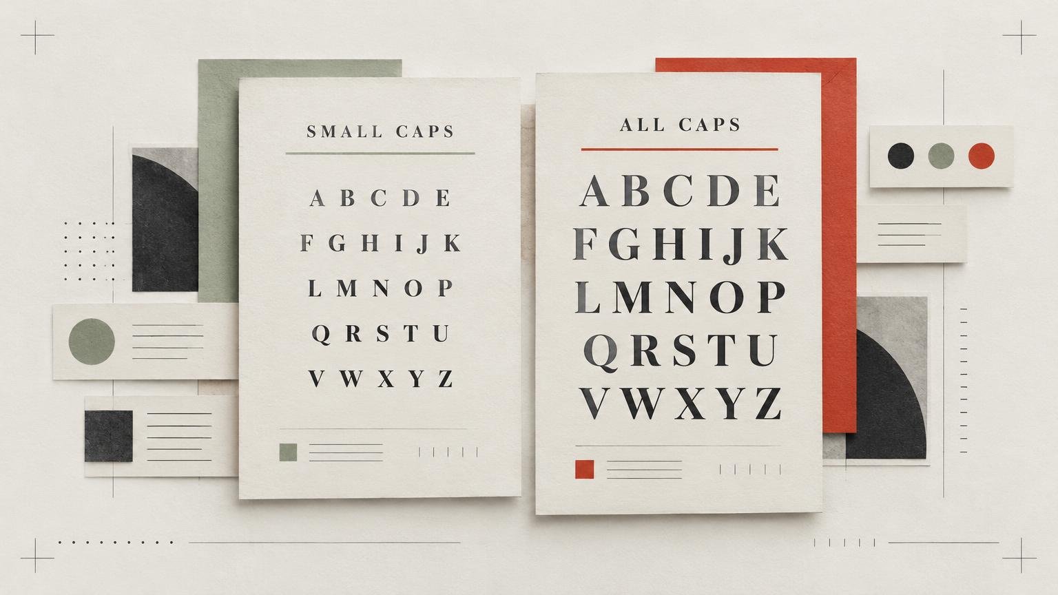
The key visual difference is apparent volume. Full capitals produce a relatively even, block-like silhouette. That regularity can make a label quick to identify as a category, but it also adds visual pressure. In a row of tabs, several all-caps words can become a fence of rectangles competing for attention.
True small caps retain the ceremonial order of capitals with less mass. They are useful when text should feel composed rather than urgent: publication dates, contributor roles, edition information, figure labels and secondary card attributes are good candidates. They can signal that information belongs to a system without pretending it is the system’s main event.
This is an aesthetic and hierarchical judgment, not a universal readability law. Typeface width, weight, contrast, spacing and rendering all alter the result. A sturdy sans serif in full caps may remain calmer than delicate small caps with overgenerous spacing. Judge the complete setting, not the capitalization label in the control panel.
| Treatment | Visual effect | Best starting use | Main risk |
|---|---|---|---|
| True small caps | Ordered and restrained | Metadata, captions, dates and secondary attributes | Weak font support or an overly delicate result |
| All caps | Direct and emphatic | Short commands, tabs, warnings and utility labels | Too much competition across the interface |
| Mixed case | Familiar word shapes and lower visual pressure | Longer labels, instructions and dense components | May provide less categorical emphasis |
Where true small caps work best
Small caps are strongest when the information is useful but subordinate. Consider a product label with a brand name, variety, net quantity and batch code. The variety may deserve ordinary display type, while “BATCH” and “BEST BEFORE” can use small caps as compact identifiers. The hierarchy remains legible because the labels share a texture without overpowering the variable information beside them.
The same logic works in editorial captions. A role such as “PHOTOGRAPHY” or “ILLUSTRATION” can appear in small caps before a mixed-case name. On a card or game component, small caps can separate attribute names from their values, provided the final size and printing conditions preserve the detail. For a broader example of how attributes, icons and text compete within a compact component, see these card design lessons on clarity and visual hierarchy.
Small caps also suit packaging systems with many repeated identifiers. Repetition already creates emphasis, so each occurrence does not need to shout. A consistent small-cap style for flavor categories, batch fields or storage notes can make a family of labels feel controlled. The typography still has to support the larger information architecture described in these small-batch packaging ideas.
Avoid treating small caps as decorative seasoning. Applying them to every subtitle, caption and metadata field can flatten the hierarchy just as effectively as using all caps everywhere. Reserve them for one defined class of information, then document that role in the type system.
When all caps is cleaner
Full capitals are often the better choice for extremely short, functional labels. “ON,” “OFF,” “SAVE,” “NEW” and “EXIT” benefit less from subtle typographic texture than from immediate categorical presence. All caps can also give compact tabs, stamps and utility navigation a deliberately mechanical consistency.
Warnings and status labels may need stronger differentiation, although capitalization should not carry that responsibility alone. Position, wording, contrast, icons and component styling also contribute. If every status is uppercase, colored and boxed, a genuinely important warning has nowhere left to go.
All caps becomes less convincing as the string grows. A two-word tab may be crisp; a full instruction or descriptive caption can become visually tiring and spatially expensive. MDN cautions that lengthy passages in all-small-caps or all-petite-caps can be difficult for some readers with cognitive concerns, including dyslexia. That warning concerns extended text rather than every short label, but it reinforces a sensible rule: do not turn capitalization into a reading obstacle.
W3C frames digital accessibility around content being perceivable, operable, understandable and robust; it does not prescribe small caps or all caps as a universal winner. Use semantic wording, adequate presentation and user-resilient layouts rather than claiming that a capitalization style is inherently accessible.
Tracking is a fit problem, not a magic number
Capitals often benefit from deliberate tracking, but there is no responsible universal value. A narrow grotesque, a wide geometric sans and a high-contrast serif do not start with the same internal spacing. True small caps may already have spacing designed for their role, while faux small caps can look both thin and oddly disconnected.
Start with the font’s default spacing. Increase tracking only until the label stops feeling compressed, then stop before the letters separate into individual objects. The test is whether the word reads as one unit while fitting comfortably inside its component.
Use realistic strings rather than a tidy specimen word. “DATE” may look excellent while “ACCOUNT SETTINGS” overruns the component. Test the shortest and longest expected labels, repeated letter combinations, punctuation, numerals and acronyms. Initialisms can be especially awkward because they are already capital structures; converting surrounding text to small caps may erase a useful distinction.
Spacing should also be evaluated with the final weight and background. Reversed white text can appear lighter than dark text on a pale field. A semibold label may tolerate slightly more space than a fine regular weight, but the correct adjustment remains typeface- and context-dependent.
Verify font support before committing to the system
In InDesign, OpenType options vary with the selected font. Adobe distinguishes OpenType All Small Caps from the ordinary Small Caps controls, so seeing a small-caps command is not by itself proof that the font contains genuine small-cap glyphs. Inspect the font’s supported OpenType attributes and use the Glyphs panel to examine the available characters. Adobe documents the Glyphs panel specifically as a way to view glyphs in the selected font.
On the web, font-variant-caps: small-caps corresponds to smcp, while font-variant-caps: all-small-caps uses both smcp and c2sc. MDN also notes that browsers may synthesize forms from uppercase letters when the requested glyphs are unavailable. MDN’s font-variant-caps reference explains the available values and fallback behavior.
That means successful CSS is not proof of successful typography. Inspect the deployed font, not merely the stylesheet. Compare strokes and proportions with the full capitals. If the small forms look conspicuously thinner or simply appear to be reduced copies, the result may be synthesized. Test font loading and fallback states as well; a fallback family can change width, spacing and feature support.
Test at actual size in the actual component
Typography judged at 400% zoom is wonderfully confident and occasionally useless. Build the real component and place three versions beside one another: true small caps, full capitals and mixed case. Keep their role, color and surrounding spacing consistent so capitalization is the principal variable.
- Use the real label copy, plus the longest string the system is expected to handle.
- Check lowercase input, uppercase input, acronyms, numerals, punctuation and symbols.
- Test the normal, selected, disabled, warning and reversed-color states that the component requires.
- View screen text at its intended display size and test zoom or text adaptation without clipping.
- Print packaging, cards or captions at final physical size rather than relying on an enlarged PDF preview.
- Check truncation and wrapping. A treatment that works only when every label fits on one line is not yet a system.
- If the design will be localized, test representative longer strings and verify language-specific casing separately.
For print, use a physical proof that reflects the intended process whenever possible. Fine strokes, small counters and tight spacing can behave differently after production, but the exact limit depends on the material and method. Do not invent a universal minimum type size; ask the selected producer for current specifications and test the actual artwork.
For interfaces, do not lock text into a component whose height and width assume one rendering. Users may enlarge text, substitute fonts or view the interface under different conditions. A capitalization choice is successful only if the component continues to communicate when the pristine mockup is no longer in charge.
A fast decision checklist
- Choose true small caps when metadata or secondary labels need uppercase structure with a quieter texture.
- Choose all caps when a short command, state or category requires intentional emphasis.
- Choose mixed case when the label is long, dense, instructional or likely to wrap.
- Reject faux small caps when their reduced strokes look weak beside the surrounding typography.
- Confirm smcp and, where needed, c2sc support before making small caps part of a reusable system.
- Adjust tracking by typeface, weight, string and component—not by a copied universal number.
- Test the longest realistic text at final screen or print size before approving the style.
Choose the amount of emphasis the information deserves
Use small caps when you want uppercase structure with a quieter texture. Use full capitals when stronger emphasis is intentional and the text is short enough to support it. If neither treatment makes the component easier to scan, return to mixed case rather than forcing a typographic mannerism.
The most useful test is simple: set one real label in all three treatments, place it inside the finished hierarchy and view it at actual size. The version that identifies the information without stealing attention from the next level has done the job.