
Why Bright RGB Colors Look Duller in Print—and What Designers Should Do About It
TLDR: When RGB colors dull in print design, the answer is not to increase saturation and hope. Confirm the actual printing condition, preserve the document’s profile, soft-proof through the correct output profile, and revise the palette as a system. If color carries real brand or campaign weight, approve a physical proof before production.
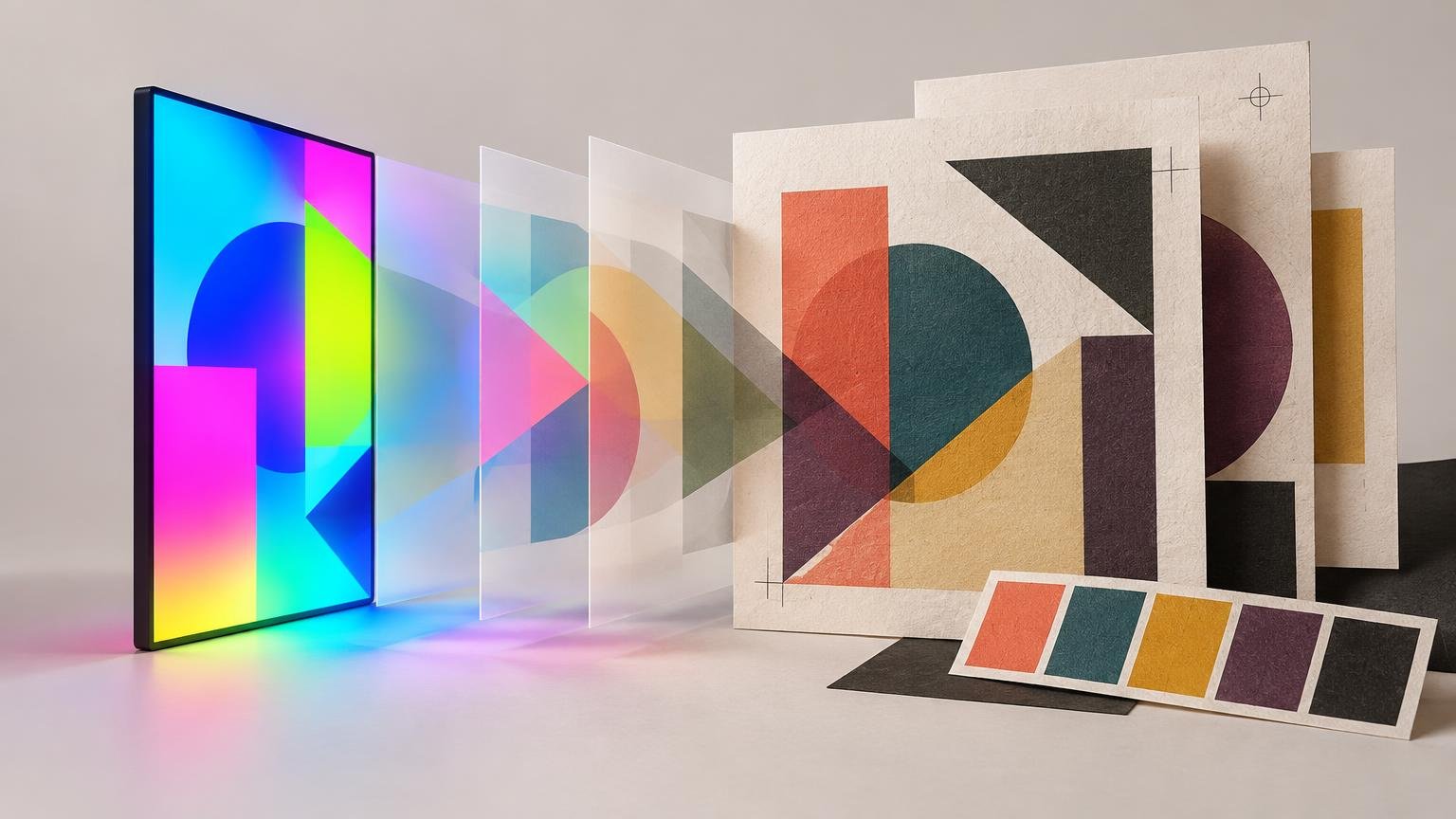
A vivid RGB file is not defective. It was built for a display that emits light, while ordinary print relies on ink and light reflected from a substrate. Some display colors cannot be reproduced by a particular combination of press, ink, paper and finish. Color conversion can negotiate that mismatch; it cannot persuade paper to behave like a luminous screen.
Why RGB colors look dull in print design
The useful concept is gamut: the range of colors available under a particular color condition. An RGB working space has one gamut, but there is no single universal “print gamut.” Each output condition has its own limits. A commercial press on coated stock, an uncoated brochure, a desktop inkjet and a label-production process should not be treated as interchangeable.
ICC color management exists to translate color appearances between devices and output conditions. When a destination cannot reproduce a source color, the conversion must map that color to something it can produce. Rendering intents offer different strategies for making that compromise. The International Color Consortium’s introduction to ICC profiles explains this relationship between device profiles, differing gamuts and rendering choices.
The most obvious casualties are often highly saturated greens, cyans, blues, oranges and neon-like colors. But a universal blacklist of unprintable hex codes would be misleading. A color can be outside one output gamut and inside another. Its surroundings matter too: a converted accent may still look energetic against charcoal, yet feel lifeless beside several equally strong colors.
Identify the output condition before changing the artwork
Do not start by converting the document to an arbitrary CMYK profile. Ask the printer what workflow it expects. You need to know whether it wants RGB artwork with embedded profiles, a conversion to a supplied CMYK profile, or a particular PDF standard. Also confirm the substrate, finish and proof options. Without those details, “make it print-safe” is not a specification; it is a shrug wearing a lanyard.
Profiles must be handled intentionally. Adobe’s documentation distinguishes embedding a profile from changing or converting a document’s profile, which is why profile decisions should not be left to a blind final export. Assigning the wrong profile merely changes how existing numbers are interpreted; converting with the correct source and destination information is designed to preserve appearance as far as the destination allows.
- Confirm the printing process, substrate and finish.
- Obtain the printer’s current file-preparation requirements and output profile, if one is provided.
- Keep the source document’s profile embedded and known.
- Duplicate the artwork or create a controlled print version before making output-specific changes.
- Set up a soft proof for the named output condition rather than using a generic CMYK preview.
- Review the proofed palette, gradients, small type, transparencies and overprinting separately.
- Request a physical proof or swatch test when the consequence of a color miss is significant.
Use soft proofing as a preview, not a prophecy
A soft proof uses an output profile to simulate a print condition on screen. In Photoshop, a custom proof setup can select the relevant output profile and, where supported, simulate paper color and black ink. Adobe also warns that the reliability of this preview depends on the display, monitor profile, output profile and ambient lighting. A poor monitor under dramatic studio lighting does not become trustworthy because Proof Colors is switched on.
Toggle the soft proof rather than staring only at the simulated version. The comparison reveals what changed: perhaps the hero green lost chroma, a shadow closed up, or three previously distinct blues moved toward one another. Illustrator’s Out of Gamut Warning can also flag a selected color that falls outside the printable range of CMYK printers, but that warning is diagnostic rather than a complete design verdict.
Treat the screen simulation as directional evidence. Adobe notes that soft proofing alone does not accurately preview overprinting. Transparency interactions, fine detail, ink behavior and the appearance of the actual substrate still require appropriate production checks. A profile is a model of a condition, not a tiny printing press hidden behind the monitor.
| Check | What it can reveal | What it cannot guarantee |
|---|---|---|
| Out-of-gamut warning | A selected color may exceed the target process range | The best replacement color or final printed appearance |
| Soft proof | Likely gamut mapping, paper tone and black-point changes | Exact appearance on every display or under every light |
| Physical proof | The combined effect of a defined proof process and physical surface | A different press, stock, finish or uncontrolled production condition |
Redesign the palette instead of boosting saturation
The common panic response is to select the dull-looking color, drag Saturation to the right and congratulate the slider. That often fails because an already clipped color has nowhere useful to go. It may convert to nearly the same printable value while damaging texture, gradients or separation from neighboring colors.
I would protect relationships before chasing the original RGB intensity. Ask what the color does in the composition. Is it the primary call to action, a category code, a background field or a decorative flare? Preserve that role through lightness contrast, scale, spacing and neighboring color choices. A slightly quieter orange can still dominate if the surrounding palette stops shouting over it.
This is where palette discipline becomes production discipline. If the layout contains six high-chroma colors competing for attention, conversion will expose the lack of hierarchy. Assign each color a job, remove near-duplicates and reserve the strongest printable accent for the element that needs it. The same role-based method is useful when you need to fix a brand palette with too many colors.
A practical before-and-after critique
Imagine a poster built around an electric cyan headline, a vivid violet gradient and a hot green button. In the soft proof, the cyan and green lose intensity while the violet gradient develops a flatter middle. Blindly increasing all three colors preserves the competition, not the impact.
A better print adaptation might deepen the background, simplify the gradient, shift the headline toward the strongest distinct cyan available in the target condition and let the green occupy less area. The result is not numerically identical to the screen version. It is visually equivalent in purpose: the headline arrives first, the action remains obvious and the background supports both.
- Compare relative lightness, not saturation alone.
- Check whether adjacent hues remain distinguishable after conversion.
- Inspect gradients for banding, muddy transitions or an unintended neutral zone.
- Use dark or quiet surroundings to make a constrained accent feel brighter.
- Reduce the number of competing accents before intensifying the chosen one.
- Test the layout at its final physical size; a tiny vivid detail can become colored grit.
- Keep essential labels, states and instructions understandable without relying on color alone.
That final point is also good cross-format design. For web content, W3C guidance says color should not be the only visual means of conveying information. That is a digital accessibility requirement rather than a print-production specification, but the underlying communication lesson travels well: pair color with text, shape, position, pattern or another visible cue.
Design neon energy without pretending process ink is light
A neon effect and a neon ink are different decisions. Ordinary process printing can suggest energy through contrast, scale, sharp edges, dark surrounds and restrained use of a bright accent. It cannot reproduce the emitted glow of a display. Adding a fuzzy outer glow to every object usually produces haze, not electricity.
When true high-chroma color is central to the concept, ask whether the production route supports a spot ink, fluorescent ink, foil or expanded-gamut process. Pantone describes spot inks as individually mixed and generally cleaner and brighter than four-color process simulations; its systems include neon options. Pantone also describes CMYKOGV as a seven-color expanded-gamut process that can simulate many spot colors. These are production possibilities, not promises that every printer offers them or that they will look identical to RGB light.
Make the special treatment earn its cost and complexity. A fluorescent accent on one decisive element is usually more coherent than treating the entire page like a nightclub emergency exit. If you are still choosing a suitable production route, a broader print option such as Printiverse can be a next step, but confirm current capabilities, profiles, proofing and stock requirements directly before adapting the file.
Know when a physical proof is necessary
A hard proof is a printed simulation for a selected output device. Adobe states that a professional color proof is more accurate for previewing final press output than a proof made on an ordinary desktop printer. The distinction matters: printing the PDF on the office machine may catch a missing image or unreadably small type, but it does not automatically validate a commercial press condition.
Request an appropriate proof when color identifies a brand, separates product variants, affects packaging approval, carries a collectible treatment or dominates a high-visibility campaign. A swatch test can be even more useful when the decision concerns a few critical colors across real materials. For subtle neutrals and warm off-whites, the surrounding palette is particularly influential; the same issue appears when trying to match ivory Pantone colors with other design elements.
Approve the proof under sensible viewing conditions and record what it represents: printer or process, profile, stock, finish and date. If the production stock or process changes later, the old approval may no longer answer the new question.
Document separate digital and print color systems
A resilient brand palette should not pretend one set of numbers is universal. Record digital RGB or hex values separately from approved process values and any spot-color references. Add the assumptions that make the print values meaningful: output profile, substrate or stock family, finish, proof status and an ordinary-process fallback when the preferred treatment is unavailable.
This documentation prevents future designers from converting the same luminous master color in five different ways. It also makes the tradeoff explicit. The digital version may use a wider-gamut accent; the print version may use a darker surround, a quieter secondary palette or a special ink to preserve comparable emphasis.
Design for the output gamut early
When bright RGB artwork prints dull, conversion is only revealing a constraint that was present from the start. Define the output condition before polishing the palette, preview it through the correct profile and adjust hierarchy rather than attacking the saturation control. Then prove the real object when color matters enough to affect approval, recognition or use.
The goal is not to force print to impersonate a screen. It is to make the printed design feel intentional in its own medium. Build that version early, and the final conversion becomes a managed compromise instead of a late-stage creative collapse.
References
- Introduction to the ICC profile format — International Color Consortium
- Color profiles in Photoshop | Photoshop
- helpx.adobe.com
- helpx.adobe.com
- Proofing colors in Photoshop | Photoshop
- Use Color Picker in Illustrator | Illustrator
- Understanding Success Criterion 1.4.1: Use of Color | WAI | W3C
- PANTONE® USA | What Are Your Color Spaces?
- Use Photoshop with a commercial printing press | Photoshop