How to Fix a Brand Palette With Too Many Colors
TLDR: The best brand palette too many colors fix is not to delete whichever swatches you like least. Inventory the colors in use, group near-duplicates, assign functional roles and remove any color that cannot justify a distinct job. Then test the reduced system in actual layouts rather than admiring a tidy row of circles in a brand guide.
A palette is too large when several colors compete for the same purpose. If three blues can all be used for buttons, headings and decorative panels, the problem is not abundance; it is ambiguity. Designers will choose inconsistently, templates will drift and every new campaign will add another allegedly essential shade.
The goal is therefore not a fashionable five-color palette. It is a usable system in which the primary color establishes identity, support colors extend the visual range, accents direct attention and neutrals carry most of the structural work. Every color needs a job, and jobs should not be handed out merely because two swatches look pleasant together.
Start with the palette you actually use
Do not begin with the official palette page. Begin with the files. Audit current website components, presentation templates, social graphics, email designs, packaging, sales documents and inherited logo folders. The operational palette is often much larger than the approved one because it includes old values, improvised tints and colors copied from previous campaigns.
Record each color value and, more importantly, where it appears. A swatch without context tells you very little. The same dark blue might be an identity color in the logo, a text color in a presentation and an interface color on a button. Those uses impose different requirements.
- Capture the exact color value and any documented name.
- List the layouts, templates or components using it.
- Record its apparent role: identity, text, surface, border, action, status or decoration.
- Note whether another color already performs the same role.
- Flag campaign, product or event colors that may not belong in the permanent core palette.
This audit separates intentional range from accumulated debris. It also stops the loudest stakeholder from protecting a favorite swatch with a story invented five minutes before the meeting.
Group near-duplicates by behavior, not appearance alone
Place similar colors beside one another, then compare what they do. Two blues may look slightly different on a palette sheet but behave identically when used as a small icon, a heading or a background block. If designers cannot explain when to use one instead of the other, they are probably duplicates at the system level.
Do not use a universal numerical threshold to decide whether swatches are too similar. The practical question is whether the difference remains meaningful in the formats and sizes where the colors appear. Test them in representative layouts, not just as generous squares on a bright monitor.
When two near-duplicates compete, choose the survivor using functional criteria:
- Which one is more established in recognizable identity assets?
- Which one works across the broadest set of approved uses?
- Which one produces more useful light and dark pairings?
- Does either color carry a distinct semantic meaning?
- Would removing one break a real layout, or merely change it slightly?
If removing a color exposes a genuine missing role, keep or replace it deliberately. If nobody notices except while comparing two swatches side by side, consolidation is usually the better decision.
Build a role-based core palette
Once duplicates are grouped, stop naming colors only by hue. Names such as Ocean Blue, Deep Ocean and Ocean Midnight may sound branded, but they do not tell a designer what to do. Define roles first and attach color values to those roles.
| Role | Communication job | Typical uses | Warning sign |
|---|---|---|---|
| Primary | Anchor the identity | Logo emphasis, major brand moments, selected large areas | It appears on every element simply because it is the brand color |
| Support | Extend the visual range | Secondary sections, illustrations, categories, supporting graphics | Several support colors are interchangeable |
| Accent | Direct attention sparingly | Calls to action, highlights, key data points | It appears so often that nothing feels emphasized |
| Neutral | Build hierarchy and structure | Text, surfaces, borders, dividers, quiet backgrounds | Brand colors are forced to perform basic layout work |
| Semantic | Communicate a defined state | Success, warning, error, information or category meaning | Meaning depends on color alone |
The exact number in each group depends on the work. A restrained professional identity and a children’s product line do not need identical palette sizes. What matters is that each addition expands capability instead of duplicating an existing function.
A useful primary color is an anchor, not a compulsory coating. If the logo is bright orange, that does not automatically make orange suitable for body text, button labels, large reading surfaces and every chart series. Identity value and functional suitability are separate questions.
For a compact example, imagine a palette containing navy, slightly darker navy, royal blue, cyan, coral, orange, pale gray, medium gray and charcoal. The likely reduction is not simply “keep five.” It might retain navy as the primary, cyan as support, coral as the scarce accent and the three neutrals for text and surfaces. Royal blue and orange should survive only if they own distinct roles that the remaining colors cannot perform.
Treat accents as scarce resources
An accent works because it is unusual. If coral appears on every heading, icon, button, quote mark and decorative squiggle, it stops directing attention and becomes another primary color wearing an accent badge.
Choose the most important repeated action or message in each layout and let the accent help identify it. That might be the main call to action on a landing page, a deadline in an event graphic or one critical data series in a chart. Secondary actions should usually be quieter.
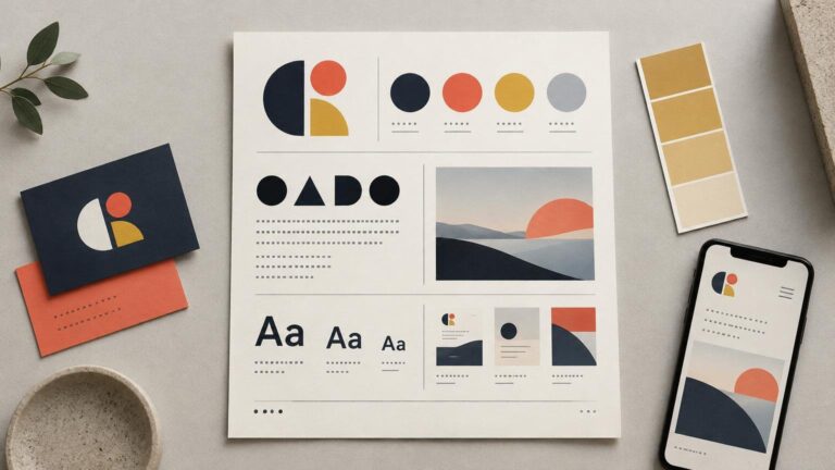
Color blocking can be useful for learning this hierarchy because the visual roles are exposed rather than hidden inside decoration. The examples in these palette lessons from compact color-blocked figures show how a dominant hue, a limited accent and neutrals can remain distinct even at a small scale.
Build the neutral system separately
Many overgrown palettes are compensating for weak neutrals. When there is no dependable dark text color, subdued border color or quiet surface color, designers reach for brand hues. The result looks energetic in a swatch row and exhausting in a real document.
Build neutrals around layout jobs: strong text, secondary text, borders, muted surfaces and primary surfaces. Not every project needs a different swatch for every role, but the roles should be considered explicitly. A warm brand may benefit aesthetically from warm grays; a cooler identity may suit more neutral or blue-leaning grays. That is a design judgment, not a universal technical requirement.
Keep neutral hierarchy visible without making every step microscopic. If two grays are indistinguishable in the borders, captions and backgrounds where they are assigned, combine them. More swatches do not create more nuance when nobody can perceive or apply the distinction reliably.
Test accessibility pairings, not the palette in isolation
A palette is not accessible merely because its colors look distinct on a brand board. Accessibility depends on specific uses and pairings. For normal-size web text, WCAG Success Criterion 1.4.3 sets a Level AA minimum contrast ratio of 4.5:1 between text and its background; large-scale text has a minimum of 3:1. The W3C guidance on minimum contrast explains the criterion and its context.
Check the combinations you intend to permit: body text on each approved surface, button labels on button fills, links within surrounding text and text placed over brand-colored panels. A primary color can remain valuable to the identity even if it is unsuitable for small text. Restricting a color’s role is often better than deleting it.
Also test charts, status messages, selected controls and form errors. WCAG requires that color not be the only visual means used to convey information. Add labels, icons, patterns, underlines or other visible cues where meaning would otherwise disappear for someone who cannot distinguish the colors.
Passing a few contrast checks does not certify an entire identity system as accessible. It establishes that those tested foreground and background combinations meet the selected requirement. Document the permitted pairings so the result can be repeated rather than rediscovered in every layout.
Stress-test the reduced palette in real formats
A palette sheet is a beauty contest. A layout is a job interview. Apply the proposed system to several representative pieces before deleting old values:
- A text-heavy page with headings, links, body copy and a call to action.
- A promotional graphic that needs clear emphasis without becoming a confetti cannon.
- A chart or comparison where series must remain distinguishable.
- An interface state containing default, selected, warning and error information.
- A presentation slide with a title, data, annotation and quiet supporting text.
- A small-format asset where subtle differences may collapse.
Run a replacement test. Substitute each retiring color with its proposed survivor and inspect the result at the intended size. Adobe Illustrator provides recoloring controls for assigning and adjusting colors across artwork, which can speed up this exploration, but the software does not decide which hierarchy is appropriate for the brand.
Ask what became worse after each replacement. If a category lost a necessary distinction, you may need another support or semantic color. If the layout merely became calmer, the removed swatch was probably adding noise rather than capability.
Document roles instead of publishing a prettier swatch page
The final guide should explain decisions. For each color, document its base value, role, permitted uses, prohibited uses and approved foreground or background pairings. Include examples showing how the system behaves in ordinary layouts, not only polished launch graphics.
Usage proportions can provide flexible guidance, but do not turn them into a rigid recipe. Say that neutrals should usually carry most reading surfaces, the primary color should establish identity and accents should remain scarce. That is more useful than requiring every composition to hit an exact percentage regardless of format.
Digital teams can separate raw color values from role-based names. Figma documents that variables can be organized into collections and groups and can reference other variables through aliases. That makes it possible to keep a base value such as blue-700 while assigning it to a functional role such as text-brand or action-primary. If the base value changes, the role can continue to express the design decision rather than a hue name.
Campaign and product palettes can live outside the core system when they have a defined lifespan or scope. Give them boundaries: which templates they may enter, which core roles they may replace and when they should be retired. Otherwise every campaign color eventually wanders into the permanent palette and refuses to leave.
The final deletion test
Before approving the reduced palette, challenge every surviving color with one question: what breaks if this disappears? A strong answer names a communication role. “The warning state becomes indistinguishable,” “the identity loses its established anchor” or “the chart no longer has enough usable series” may justify retention. “We have always had it” does not.
If removing a swatch breaks a layout, identify the missing role before restoring the hue. That keeps the decision attached to communication rather than nostalgia. If two colors still perform the same job, choose the more useful survivor and retire the other across templates, libraries and guidelines.
A palette becomes usable when every color has a job; colors without jobs are just future inconsistency.