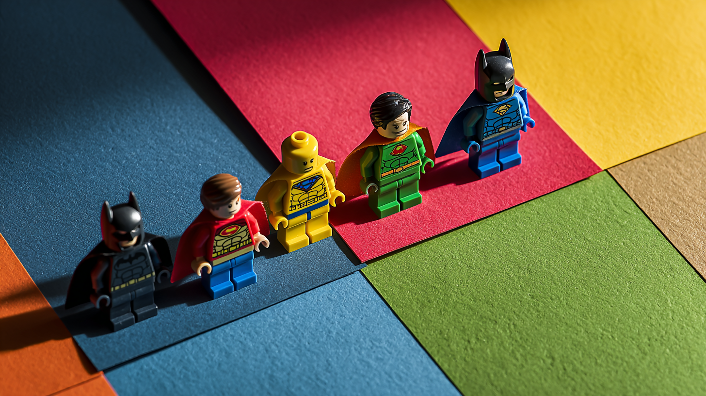
Minifig Color-Blocking: five palette lessons from superhero minis
ntroduction – small bricks, giant color clues
Every time I need a crash course in bold palettes, I dump a handful of minifig color-blocking examples on my desk. Those tiny capes and helmets look playful, yet each shows a razor-clean split between main hue, accent, and neutral. By studying superhero minifigs you can spot patterns that translate directly into brand schemes, UI mock-ups, or packaging drafts. In this guide I pull five lessons—plus quick studio exercises—that turn pocket-size figures into pocket-size professors.
Why minifig color-blocking belongs in every design kit
- Limited surface forces clarity – a torso and two legs give you maybe ten printable millimeters, so the palette must read instantly.
- High-contrast printing – factories favor saturated inks and molded plastics, giving clear demos of what 100 percent chroma looks like without monitor calibration headaches.
- Universal silhouette – because every figure shares the same outline, color decisions stand front and center, unmasked by shape changes.
If you need a refresher on hue basics before diving in, bookmark the site’s primer on quick color-wheel tricks and keep it open for reference.
Lesson 1 – Primary punch beats pastel drift
Classic heroes rely on two primaries and one neutral. Red-blue-black or yellow-blue-white makes the character pop from any backdrop. Transplant that trio into a dashboard mock-up: main buttons adopt the hero’s punchy red, secondary actions shift to blue, and black text grounds the interaction. Students in my workshops grasp hierarchy faster when I show them two figures wearing strong primaries side by side and ask which one feels “foreground.” Ninety seconds later they are rearranging their own wireframes.
Micro exercise
- Snap a photo of a primary-heavy minifig under neutral light.
- Sample the three key hues into your design tool’s swatch panel.
- Restrict your next social-media graphic to those colors only. Notice how little you miss extra shades.
Lesson 2 – Accent restraint raises perceived quality
Look closely at the belt buckles and visor trim: most stay within five percent of the torso accent value. That restraint signals coherence. Over-enthusiastic beginners often scatter neon edges across every UI element; a figure’s focused accent teaches them to pick one highlight and repeat it sparingly. The principle mirrors web-layout advice in this ten-tip design roundup—consistency builds trust.
Micro exercise
Remove every accent color from your mock-up except one. Replace the missing pops with tint variations of that single accent at 70 percent opacity. Compare before and after; you will likely keep the leaner version.
Lesson 3 – Neutral grounding prevents eye fatigue
Even the loudest suits rely on dark greys for gloves, boots, or utility belts. These neutral zones give the retina a break and frame the hero’s signature tones. In product labels, swap those greys for natural kraft paper or matte black foil; suddenly fluorescent typography feels intentional, not carnival.
Classroom demo
Line up three figures: one all-saturation, one with 30 percent neutral, and one with 60 percent neutral. Ask your team which feels most “designed.” Votes flow toward the balanced middle.
Lesson 4 – Contrast holds at micro scale
Because each print plate must hit every edge crisply, toy makers exaggerate contrast to survive molding tolerances. Translating to screens, make sure adjacent hues differ by at least 30 points in brightness or saturation so icons stay legible at favicon size. Run your palette through a contrast checker—if it reads hero-level bold on a 32-pixel avatar, users will spot it in a cluttered feed.
Lesson 5 – Secondary stories live in removable props
Capes, shields, and helmets introduce tertiary colors that signal power type or alliance but can be removed to mute the figure for stealth missions. The takeaway: embed tertiary shades in optional UI layers (hover states, badges) rather than core components. Users get personality without distraction.
Prototype twist
Create two UI themes: one base skin with primaries and neutrals only, one festive skin that loads tertiary hues for a seasonal campaign. Toggle them like swapping a minifig’s cape—code stays the same, vibe shifts instantly.
Staying organized: the swatch-box trick
Tossing twenty figures onto a desk can overwhelm the very clarity we seek. I sort mine by dominant hue inside a clear parts sorter. Each bin holds torsos, legs, headgear, and accessories in the same color family. Before mood-boarding, I pull one combo into a small tray, shoot flat-lay photos, then slide the pieces back. No lost helmets, no frantic floor hunts.
Cost snapshot for a studio starter pack
| Item | Qty | Cost | Life span |
|---|---|---|---|
| Generic hero minifigs | 20 | $28 | Years of reference work |
| Parts sorter | 1 | $12 | Dustproof storage |
| 18 % gray card | 1 | $4 | Color-true backdrop |
| Phone lightbox | 1 | $20 | Flicker-free photos |
Under $65 equips a small team with precise, durable color references that never need a software update.
Where to restock quickly
Collectors love blind-bag surprises. Designers, less so. Consistency and speed matter more than rare prints when I am chasing a deadline. That is why I get mine from minifig.biz. Orders arrive in labeled pouches—reds in one, blues in another—so my swatch-box ritual stays painless.
Final thought – borrow boldly, design responsibly
Color theory books can intimidate new team members; a two-inch hero sparks “aha” moments in seconds. The next time your palette feels muddy, line up six minifigs against a white sheet and let their factory-fired hues remind you how confidence looks. Bold blocks today lead to brave brands tomorrow.