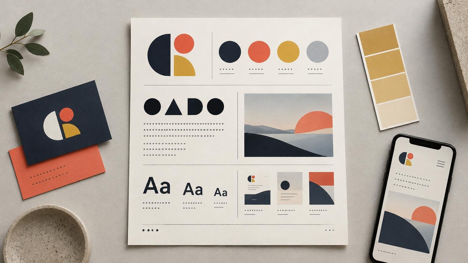
What Should a One-Page Brand Guide Include for a Small Team?
TLDR: A useful one-page brand guide is a decision sheet, not a miniature brand bible. Show the approved logo variants, assign colors and typefaces clear jobs, define image direction, include two or three realistic applications, and link to the master assets. If a rule does not change how someone makes a routine graphic, it probably does not deserve space.
The central problem with a one page brand guide small business teams can follow is not deciding what to add. It is deciding what to leave out. A crowded sheet full of brand values, decorative mockups and unexplained color swatches may look impressively branded while failing to answer the urgent question: “Which logo do I put on this dark background?”
I would build the page around repeated production decisions. Think about social posts, presentation slides, email headers, flyers, simple web sections and packaging inserts. The guide should help a teammate make those assets without improvising a new visual identity every Tuesday.
Start with the decisions your team repeatedly makes
Before opening a layout tool, list the five to seven visual decisions that cause the most hesitation. These usually concern logo choice, color combinations, type hierarchy, image selection and where to find the correct files. That list becomes the guide’s content architecture.
Use a strict keep-or-cut test: does this information change a routine design decision? “Use the white logo on dark photography” passes. A paragraph about being innovative, authentic and customer-focused does not. Those ideas may belong in a broader strategy document, but they cannot tell a teammate how to format a title slide.
Condensed brand-guide templates are a recognized format, including templates positioned for small and medium businesses. The format is not the achievement, though. A template gives you boxes; your job is to fill them with operational choices.
Give the page a rigid information hierarchy
Treat the sheet as a working interface. Place the identity, guide owner, version date and master-assets link in a narrow header. Give the most space to logos and color because mistakes there are conspicuous. Use smaller modules for typography, imagery and application examples.
| Page area | What it should contain | Why it earns space |
|---|---|---|
| Header | Brand name, owner, version and asset link | Confirms that the guide is current and points to editable files |
| Primary modules | Logo variants and color roles | Answers the most frequent and visible choices |
| Supporting modules | Type roles and image direction | Controls hierarchy and visual tone |
| Proof strip | Two or three small applications | Shows whether the rules survive real formats |
Avoid making every module the same size. Equal boxes imply equal importance and create the visual equivalent of a committee meeting. The default logo and essential text colors should be easier to find than an optional accent treatment.
Show a small, approved logo family
Start with the default logo. Then include only the alternatives that solve a genuine constraint: perhaps a reversed version for dark backgrounds, a compact mark for tight spaces and a one-color version for limited reproduction. Label the situation for each version rather than merely naming it “secondary logo.”
- Primary: use on light, quiet backgrounds whenever space allows.
- Reversed: use on dark backgrounds with enough separation from nearby details.
- Compact: use when the full lockup becomes too small or too wide for the format.
- One-color: use when the process or application cannot reproduce the full palette reliably.
Add two or three high-consequence prohibitions: do not stretch the logo, recolor it with an unapproved swatch or place it over a visually busy area. Do not invent a minimum size or clear-space formula because brand guides are “supposed” to have one. Test the logo in the actual formats first, then document a measurement that the evidence supports.
Include the filename or asset-library label beneath each version. Adobe’s Brands documentation, for example, supports organizing elements such as logos, colors, fonts, graphics and guidelines. Whatever system you use, the one-page PDF should point to the current source files rather than becoming a substitute for them.
Turn color swatches into color roles
A row of attractive squares is not a usable palette. Name what each color does: background, text, signature, action, accent or neutral. If two colors perform the same job, question whether both need to survive. Teams with an overgrown palette can use this process to assign each brand color a practical role.
List the values needed for the channels the team actually uses. HEX or another screen-oriented value can support digital work, while an approved print specification should follow the chosen print process and conversion workflow. A HEX value alone does not define the final printed result.
Separate brand recognition from readable text. For digital content covered by WCAG 2.1 Level AA, the minimum contrast ratio is 4.5:1 for normal text and 3:1 for large-scale text. Text that is part of a logo or brand name is exempt from that particular criterion. The practical response is not to treat every brand color as a body-text color. Identify the combinations approved for copy, buttons and headings, and check the actual foreground and background pairs against the W3C guidance on minimum text contrast.
A compact color module might specify dark ink for body copy, warm white for the main background, a signature blue for large headings and selected actions, and a bright accent for small highlights rather than paragraphs. That is an illustrative system, not a universal recipe. The useful part is the assignment of jobs.
Define typography by job, not by font collection
Most small teams need a display role, a body role and, occasionally, a utility role for labels or data. For each one, state the family, exact weight, use case, fallback and one behavioral rule. “Use Brand Sans” is incomplete if the family contains ten weights and nobody knows which one belongs in a heading.
| Role | Specify | Behavioral rule |
|---|---|---|
| Display | Family, weight and fallback | Keep headings short and use sentence case |
| Body | Family, weight, fallback and comfortable size range | Prefer regular weight and restrained line length |
| Utility | Family or shared body family, weight and use | Reserve for labels, captions or compact metadata |
If the team works in Figma, reusable text styles can capture properties including font family, size, line height and letter spacing. That makes the guide more useful when its named roles match the names in the working file. “Heading / Large” is easier to apply correctly than an unexplained note reading “42 px semibold.”
Do not make claims about whether a font is free, licensed for commercial work, shareable with contractors or permitted for web embedding unless the exact current license has been checked. The guide can instead link to the approved font source and license record. If collaborators cannot access the chosen family, define a fallback deliberately rather than letting software choose one by accident.
Write image direction that can survive outside your head
“Use authentic, vibrant imagery” is fog dressed as art direction. Describe choices someone can see: subject, crop, lighting, color treatment and composition. One short choose/avoid comparison is usually more useful than a mood-board collage with no explanation.
For example: choose close, naturally lit images of people using the product, with uncluttered backgrounds and open space for a headline. Avoid stiff lineups, heavy color filters, mixed lighting and crops that leave no safe area for type. This direction is specific enough to guide selection without pretending that every image must look identical.
If the identity uses a recurring graphic device, define its job and its off switch. A shape might frame a product detail or anchor a caption, but it should not appear merely because an empty corner made someone nervous. A disciplined approach to using one accent shape across a brand can keep the device recognizable without turning it into wallpaper.
Use real applications to expose weak rules
Include two or three thumbnail applications, not a gallery of glamorous mockups. Choose formats the team makes frequently and make each example prove a different part of the system.
- A social graphic tests whether the logo, short headline and accent color remain clear in a compact square or vertical composition.
- A presentation title slide or email header tests wide layouts, restrained hierarchy and the relationship between image and type.
- A flyer, simple web module or packaging insert tests body copy, calls to action and reproduction at a practical size.
Annotate the examples lightly: primary logo, display type, approved text pairing, accent used once. The aim is to reveal the design logic, not to turn a tiny example into an archaeological dig.
This stage often exposes contradictions. A palette may look elegant as swatches but fail when the signature color cannot support readable text. A compact logo may be missing just when a narrow header needs it. A display face may carry personality in a three-word headline and become exhausting in a paragraph. Fix the system when the examples reveal a problem; do not decorate the examples until the problem disappears.
Finish the guide as an operational document
The bottom of the page should tell people where to get the materials and who controls changes. Link to editable logos, export folders, color styles or tokens, font information and reusable templates. Add an owner and a clear version date so an old PDF can be identified without comparing every swatch.
- Master logo folder with approved formats
- Color styles or tokens used in current templates
- Font source and license information
- Reusable social, presentation and document templates
- Guide owner, version date and update contact
Keep deeper material and production specifications outside the one-page guide unless the team uses them constantly. Print processes, substrates and vendor requirements can change what is feasible, so they deserve a separate production note tied to the actual job. The mini guide can state where that information lives.
The final test: can someone use it without asking you?
Give the page to a teammate with a routine assignment and ask them to select a logo, construct a simple hierarchy, choose a readable color pairing and find the correct assets. Notice where they hesitate. That hesitation identifies missing information more reliably than adding another paragraph of brand philosophy.
A one page brand guide small business teams will actually use answers the visual decisions they make every week. Show the approved choices, explain their jobs and prove them in real formats. Everything else can wait for a deeper brand system later.