TLDR: In kerning vs tracking logo design, kerning repairs the relationship between specific letter pairs; tracking changes spacing across the whole word. Fix conspicuous local gaps first, then use tracking to tune overall density. Judge the result at the sizes and in the formats where the logo will actually appear.
A wordmark with poor spacing does not need a shadow, outline, gradient or decorative ligature. It needs someone to look closely at the letters. One awkward pair can split a name into visual fragments, while blanket tracking often moves every other letter away from a problem it did not have.
Kerning vs tracking in logo design
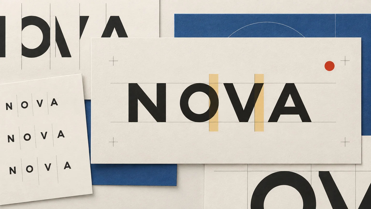
Kerning changes the space between two particular characters. Tracking changes spacing across a selected range of text. Adobe Illustrator makes the same practical distinction in its controls: kerning operates between two characters, while tracking applies across a selection.
Under the surface, kerning can be built into a font as positioning data for particular glyph pairs or classes of glyphs. The OpenType glyph-positioning specification describes this as pair adjustment positioning. A type designer might therefore define a special relationship for an uppercase A followed by V rather than leaving those two shapes at their default sidebearings.
Tracking is broader. Select the complete wordmark and increase it, and every inter-character space is affected. That makes tracking useful for changing the overall tone: tighter can feel compact and forceful; looser can feel restrained, spacious or ceremonial. Those are aesthetic tendencies, not universal rules. Typeface construction, capitalization, weight and context can reverse the impression.
Optical spacing is the judgment behind both decisions. The goal is not to make every measurable gap identical. It is to make the negative spaces between letters feel balanced when the word is read as one shape.
Find the awkward pair before changing the whole word
Start by looking at the wordmark as a silhouette. Squint, zoom out or briefly blur your attention. Where does the word appear to break? Where do two letters form a dark clump? Those interruptions identify the pairs that deserve inspection.
Imagine a wordmark reading AVANTA. The A–V combination creates a large open area above the converging diagonals. If the pair uses only rectangular character boxes as its visual logic, it may look farther apart than the following V–A relationship or the more vertical N–T region. Increasing tracking across AVANTA does not solve that imbalance. It enlarges all five spaces, including the ones that may already work.
Place the text cursor between the troublesome letters and correct that relationship first. Then inspect the two neighboring spaces because a pair never exists in splendid isolation. Pulling A and V closer may reveal that V–A now feels too loose, or that the center of the word has become disproportionately dark.
A useful critique sequence is:
- Set the word in the intended typeface, case, weight and width.
- View the complete word before editing individual pairs.
- Mark the spaces that look conspicuously open or congested.
- Adjust one pair at a time, comparing it with the spaces on both sides.
- Read the whole word again rather than admiring the corrected pair at maximum zoom.
- Only after the internal rhythm works, select the complete word and assess its overall density.
This sequence prevents the familiar typography trap in which an isolated pair becomes exquisitely polished while the word around it falls apart.
Build rhythm, not mathematically equal gaps
Letters occupy irregular shapes. An H presents vertical edges. An O curves away from its neighbors. A V opens into a wedge. Equal physical distances between their bounding boxes will not necessarily produce equal-looking spaces.
Instead, compare the apparent areas of negative space. The gap between two vertical-sided letters resembles a rectangle. The gap beside a round letter is narrower near its middle and wider toward its top and bottom. A diagonal can create a triangular opening that looks larger than its closest measured point suggests.
| Shape relationship | What to inspect | Likely mistake |
|---|---|---|
| Diagonal with diagonal, such as AV or WA | Large triangular openings and collisions near the baseline or cap height | Trusting character boxes instead of the visible contours |
| Round with vertical, such as OH or DO | Whether the curved side makes the gap appear wider | Matching the numerical gap used between two vertical forms |
| Round with round, such as OO or CO | A soft central channel that can become too open | Adding space because the closest points look tight |
| Vertical with vertical, such as HI or NN | Dark, repetitive bars and narrow rectangular gaps | Packing the pair too tightly because its geometry looks orderly |
| Uppercase sequences | Consistency of rhythm across strong cap-height shapes | Applying generous tracking before correcting disruptive pairs |
These are inspection priorities, not verdicts. An AV pair does not automatically need negative kerning, and an OO pair does not automatically need more space. Look at the actual font. A display face may already contain thoughtful kerning; a custom-drawn wordmark may deliberately exaggerate one opening to create a recognizable gesture.
Use tracking after local problems are solved
Once the pair relationships feel coherent, tracking can tune the word as a unit. Ask whether the complete mark feels cramped, neutral or excessively dispersed. Then make a restrained global adjustment and compare it with the previous version.
Adobe InDesign documents manual kerning and tracking as cumulative. In practical terms, you can retain pair-specific corrections while adjusting the broader spacing of the selected text. Its values are measured in thousandths of an em, so a displayed number is relative to the type size rather than a universal physical spacing recipe. Copying a tracking value from another logo is therefore not a design system; it is numerology with a dropdown menu.
Tracking is especially noticeable in all-caps wordmarks because the repeated cap-height forms create a strong horizontal rhythm. Looser tracking may give a short name more presence, but it also increases the logo’s width and can weaken the sense that the letters belong together. Tight tracking can make a mark compact, yet enclosed and vertical forms may merge into an unattractive dark strip at small sizes.
Compare complete alternatives rather than nudging indefinitely. A compact version, a neutral version and a slightly open version will reveal the tradeoff more clearly than thirty almost-identical copies scattered around the pasteboard.
Treat automatic and optical kerning as starting points
Metrics kerning uses positioning information supplied with the font. Optical kerning estimates adjustments from the adjacent character shapes. Adobe notes that optical kerning can be useful when a font has few built-in pairs or when adjacent characters use different typefaces or sizes. That makes it a useful diagnostic option, not an automatic winner.
Try the font’s metrics setting first, compare it with optical spacing if the software offers that option, and then inspect the actual word. A short logo receives far more attention than a paragraph, so its spacing deserves manual review even when the default setting is competent.
Software names also differ. Figma labels its across-selection control “letter spacing,” while placing the cursor between characters enables pair-specific adjustment. The terminology changes; the design distinction does not. If tool choice is disrupting the workflow, this overview of graphic design software options provides broader context, but no application can decide whether a particular wordmark feels balanced.
Retest variable fonts after changing the instance
Do not finish spacing and then casually change the font’s weight, width or optical-size setting. Figma documents variable-font controls that can include those axes, depending on the font. Changing an axis changes the letterforms or their proportions, which can alter the negative space you just balanced.
The safe order is to choose the intended variable-font instance, perform the spacing pass, and then repeat the inspection after any meaningful instance change. If the identity needs several approved configurations, such as a regular-width horizontal mark and a narrower version for constrained placements, treat them as separate spacing decisions rather than assuming one set of adjustments will transfer perfectly.
Test the wordmark at real logo sizes
A logo is not finished because it looks elegant at 800 percent. Large on-screen inspection helps expose awkward contours, but the mark must also survive its smallest intended use and its normal viewing conditions.
Build a simple test sheet with three contexts:
- Small: place the mark at the smallest realistic interface, label or print use. Check whether tight pairs clog and open pairs split apart.
- Normal: view it at the size most customers or users will encounter. This should carry the most weight in the decision.
- Large: inspect signage, presentation or display use. Small inconsistencies can become conspicuous when the mark is enlarged.
Also test a one-color version. Removing gradients and effects exposes the structure of the lettering. Reverse the mark from dark on light to light on dark because apparent weight and spacing can shift when the figure-ground relationship changes. If an outline is essential to the identity, test it at small size rather than assuming it will scale gracefully.
For physical applications, use output that resembles the intended process instead of relying only on a bright monitor. A mark destined for cards, labels, packaging or stationery should be checked in a realistic print proof. When the identity must move across several physical formats, a print production service covering multiple formats can be a practical next step for production-specific checks. The exact minimum detail and reproduction limits depend on the process, material and provider, so verify them for the real job.
Preserve the spacing in final logo artwork
Keep an editable master containing the live type, documented font name and version, selected variable-font settings, and final kerning and tracking decisions. Font-version consistency matters in collaboration: Figma warns that different installed versions can cause text to reformat. A tiny substitution can undo careful wordmark spacing without making a dramatic announcement about it.
Create production files according to the handoff requirements. Some workflows may call for outlined vectors; others benefit from retaining editable text. There is no responsible rule that every logo must always be converted to outlines. Preserve the live master either way, and check any outlined copy against it before delivery.
Include approved lockups and minimum-use examples when they materially differ. If the small-size version uses altered spacing or simplified detail, label it as a deliberate variant. That is preferable to letting every future user “fix” the logo by typing the name again and guessing at the tracking.
Fix the word before decorating it
The practical rule is simple: solve local spacing problems locally, then tune the overall word. Start with the intended typeface and instance, identify the pairs that interrupt the rhythm, correct them in context, and only then adjust tracking across the complete mark.
Finish by testing the result small, normal, large, one-color and reversed. If the word still feels fragmented without its effects, the spacing is not finished. A glow can make a logo louder. It cannot persuade two estranged letters to become a word.