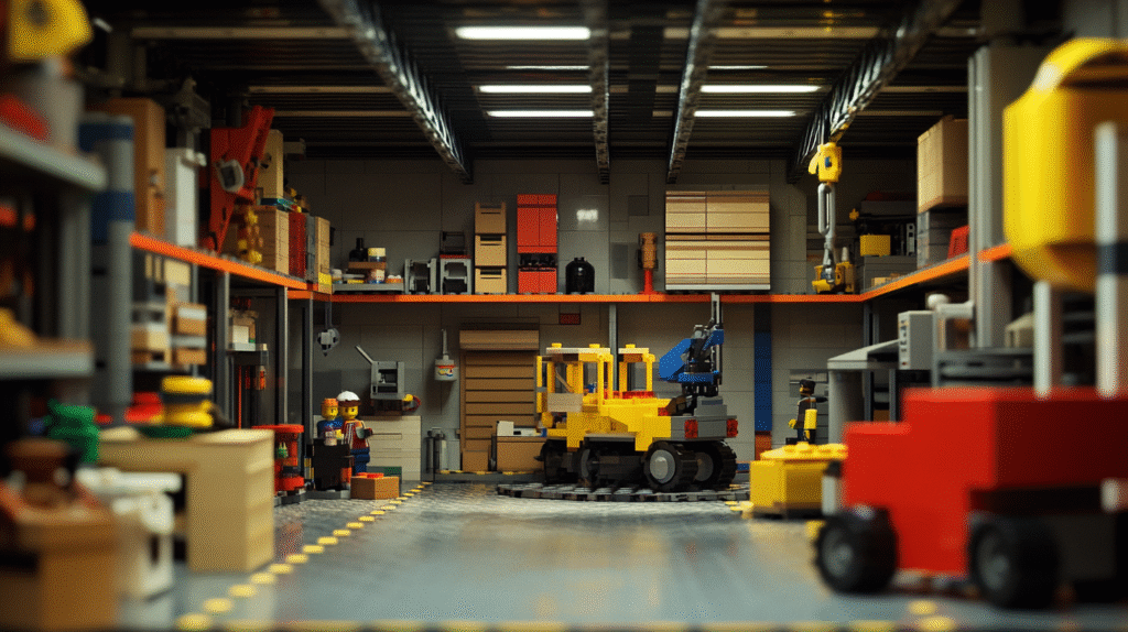
Last week, I stopped by the Minifig.biz warehouse. It’s not huge, but it’s packed. Bins of tiny heads, torsos, accessories—organized chaos in the best way. I met Matt, the warehouse manager, who was sorting a tray of tiny wizards next to some kind of zombie-punk barista. He walked me through how they group and package the figures, but what stuck with me wasn’t the logistics. It was the design.
Every figure told a story. Not with words. Not even with motion. Just through face, posture, and props. It got me thinking about how good visual storytelling works—and how much we can learn from something that fits in the palm of your hand.
Why Minifigs Work
A minifig doesn’t talk. It doesn’t move on its own. But somehow, you can tell who it is, what kind of mood it’s in, and what kind of story it might be part of. That’s because the visual cues are doing all the work.
Look at a minifig’s face. A raised eyebrow, a worried frown, or a sly grin changes everything. Add a coffee cup or a battle axe and suddenly that emotion becomes a story. Is this character late for work? Headed into a duel? Planning something weird?
The design is compact, but every part carries weight.
Good visual storytelling works the same way.
Design Is More Than Looks
When we talk about design—especially in branding or web work—there’s always a temptation to focus on the aesthetic. Colors. Fonts. Layout. And sure, those matter. But the pieces also need to say something.
A character holding a lantern in a dark cave? That’s not just about accessories. That’s about intention. The scene builds a mood. The posture creates tension. The story is already moving, even if nothing’s happening yet.
The same thing applies to how you design a homepage, a logo, or a package. What does the spacing say? What does the posture of the elements suggest? Is the message loud and centered, or quiet and tucked away?
These questions are design questions. They’re also storytelling questions.
Facial Expression and Brand Personality
This is one of the most underrated aspects of brand work—expression.
You don’t always need a literal face in your branding. But you do need an emotional tone. Is it serious? Playful? Confident? Nervous? People pick up on these cues fast. Like, faster than you’d guess.
Think about minifigs again. Two figures with the same outfit, but one has a big goofy smile and the other has a blank stare. The vibe shifts. That shift is what designers should pay attention to.
Are you choosing visuals that match the tone of what you’re saying? Or are things a little off?
A logo that’s clean but sterile. A tagline that’s casual but paired with a harsh font. These disconnects can confuse people. Or worse, make them stop paying attention.
Posture and Layout
A lot of what we read as “story” comes from posture. The way something is standing. The angle of its arms. The tilt of the head.
Minifigs don’t have a wide range of motion, but even a tiny adjustment changes how we read them. Arm forward? That’s action. Arms up? Surprise. Arm bent holding a megaphone? Okay, now we’re talking loud.
In layout design, posture shows up in spacing and flow. Are elements leaning toward the viewer, or away? Are things grouped tightly, or spaced wide and calm? Is the viewer being pulled along a path, or dropped into a static block of content?
Again, we’re back to storytelling. The way information is arranged creates rhythm. Movement. Emotion. And just like with minifigs, you can do a lot with a little.
Props and Context
This is probably the most direct link between minifigs and brand design. Props set the scene. A crown makes someone royal. A briefcase puts them in an office. A flaming sword puts them on a quest.
The same is true in design. Icons, photos, illustrations—these are the props you’re giving your brand. They shouldn’t just look nice. They should support the story you’re telling.
A landing page for an eco-friendly brand should probably not be full of chrome and black leather textures. A bakery with a sharp sans-serif font and grayscale stock images might be technically clean, but it’s not warm. It’s not delicious.
You’ve got to think like the person staging a minifig scene. What’s the goal? Who’s the audience? What emotion should this spark?
A Place to See This in Action
If you’re curious, take a scroll through Minifig.biz. You’ll see knights, aliens, teachers, astronauts, baristas, sorcerers, activists. Each one has a specific tone. Some are weird. Some are subtle. Some are straight-up ridiculous.
But they all tell a story. They all have personality.
It’s not about whether you like the theme or the joke. It’s about what you feel when you see the figure. And that’s exactly what we aim for in design.
You want someone to look at a product, a website, a brand identity—and feel like it makes sense. Like it belongs to someone. Like it’s saying something.
Final Thought
We talk a lot about storytelling in design, but it often stays abstract. Here’s the simplest way to make it concrete: look at a minifig. Notice the choices. Ask what it’s telling you.
Then ask the same questions about your own work.
Design isn’t just about making things look good. It’s about giving them character. Giving them context. Giving them a point of view.
Turns out, a two-inch figure can teach that better than most workshops.